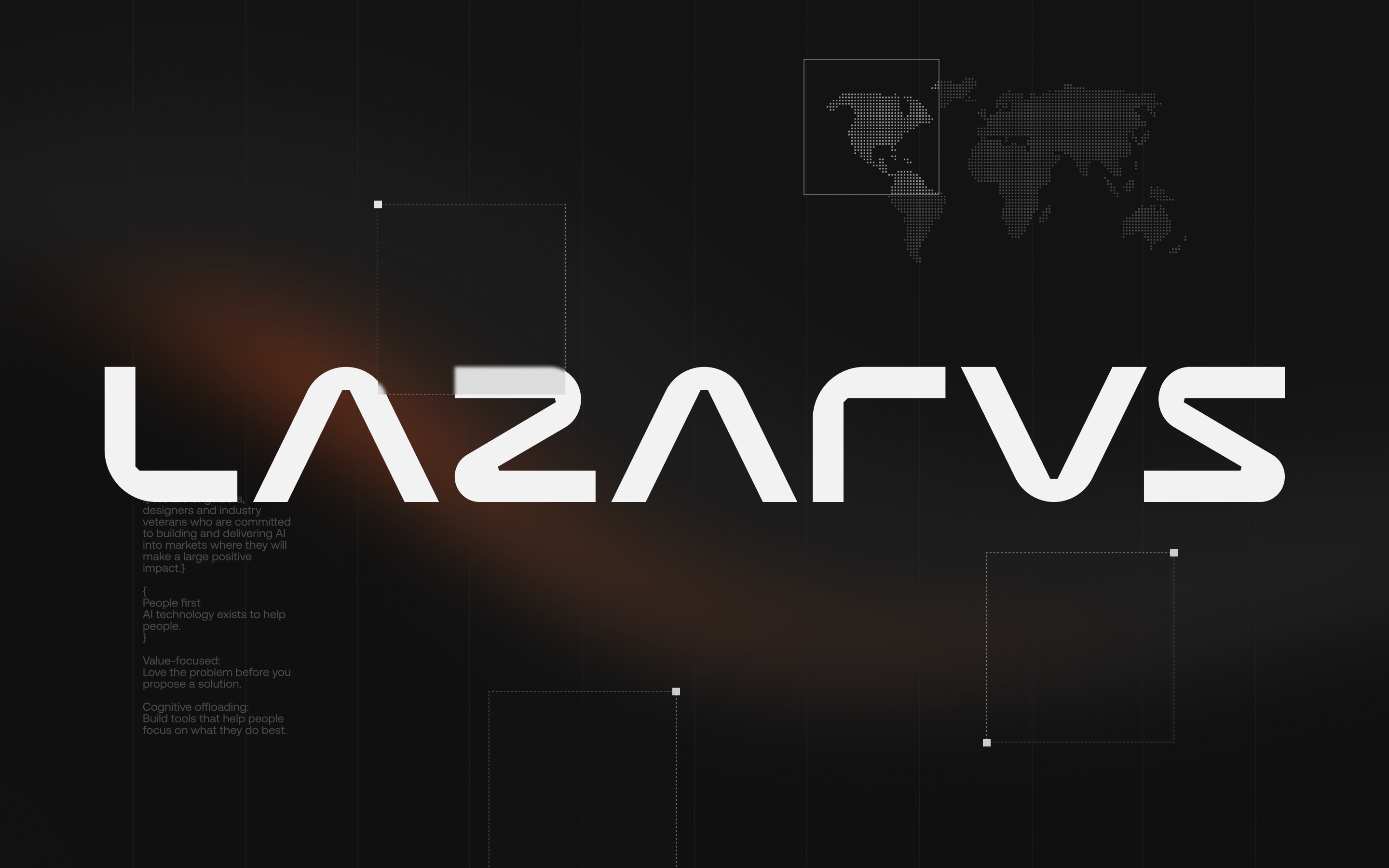
Lazarus AI
AI products that redefine how governments and insurances work.
Overview
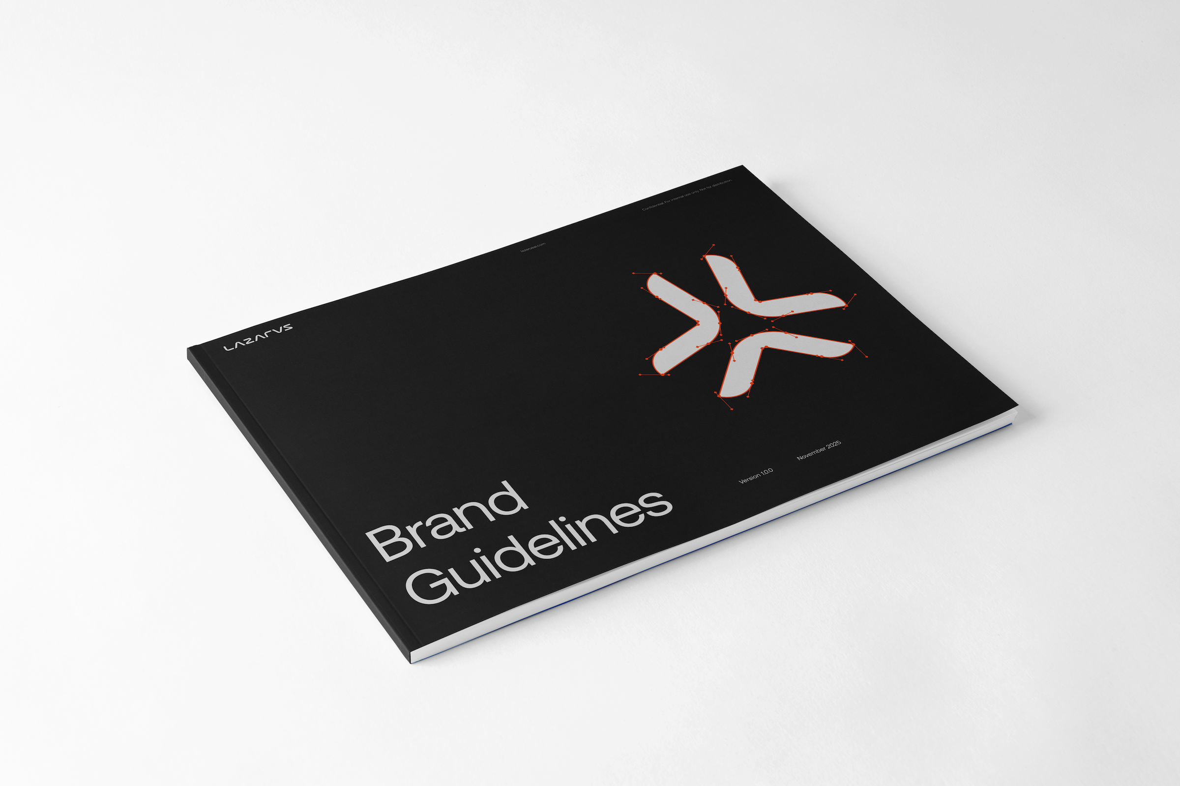
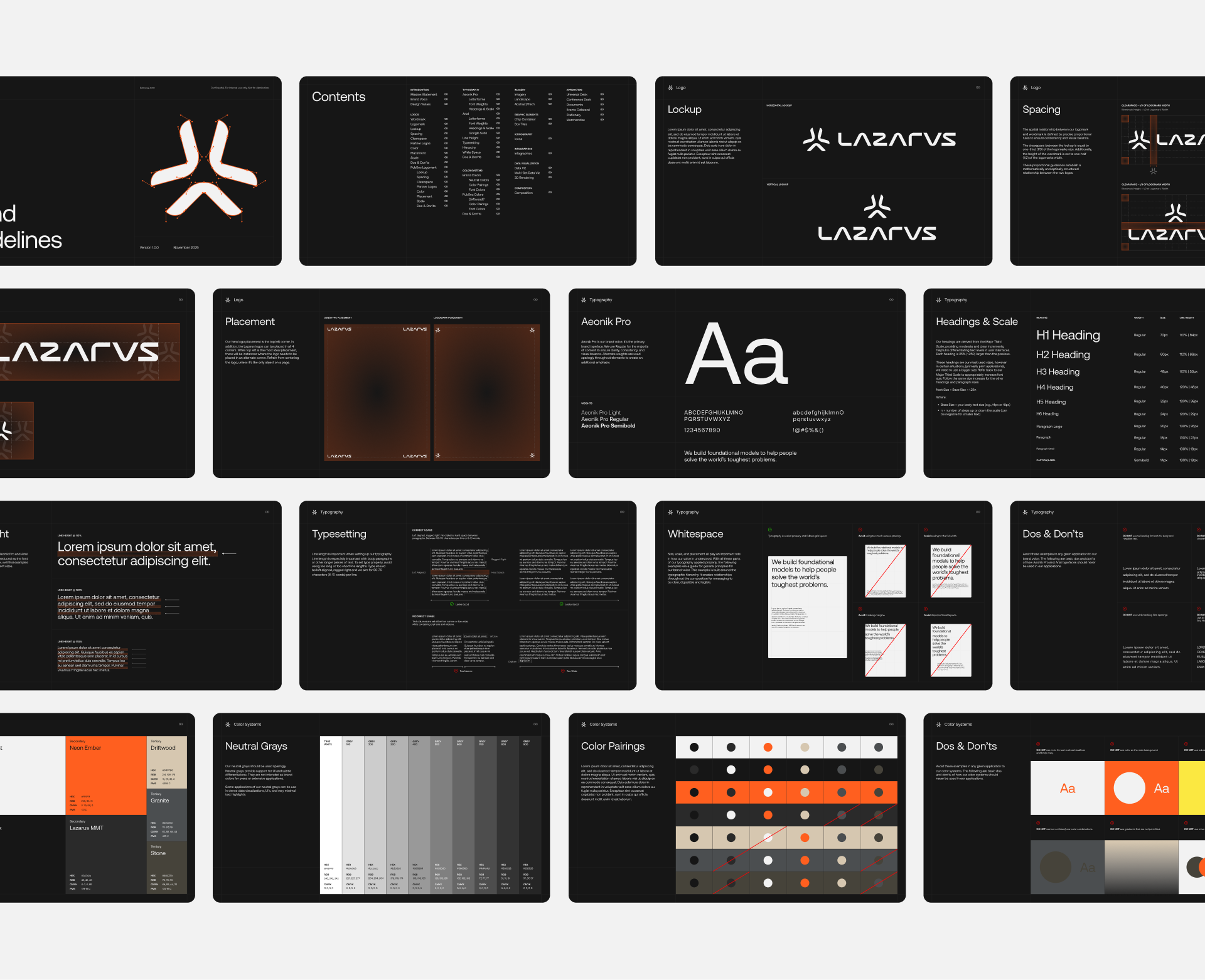
As a visual designer at Lazarus, I oversaw the refinement and expansion of the company’s brand identity through a systematic, principled approach. The work centered on establishing a cohesive visual structure and typographic discipline, consistent alignment logic, and clear rules for hierarchy and spatial organization.
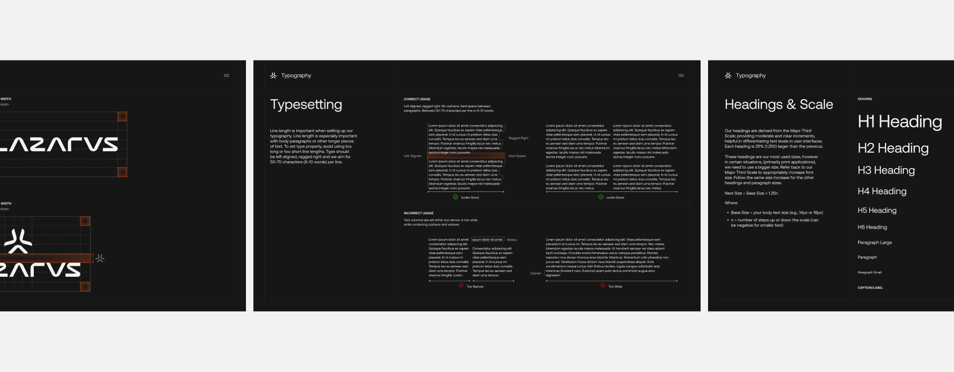
Typographic explorations included adjustments to kerning, tracking, line-height, and scale, resulting in a rhythm that could remain stable across all applications. Paragraph rags, alignment conventions, and heading structures were formalized to create predictable, repeatable patterns that reinforced the integrity of the brand.
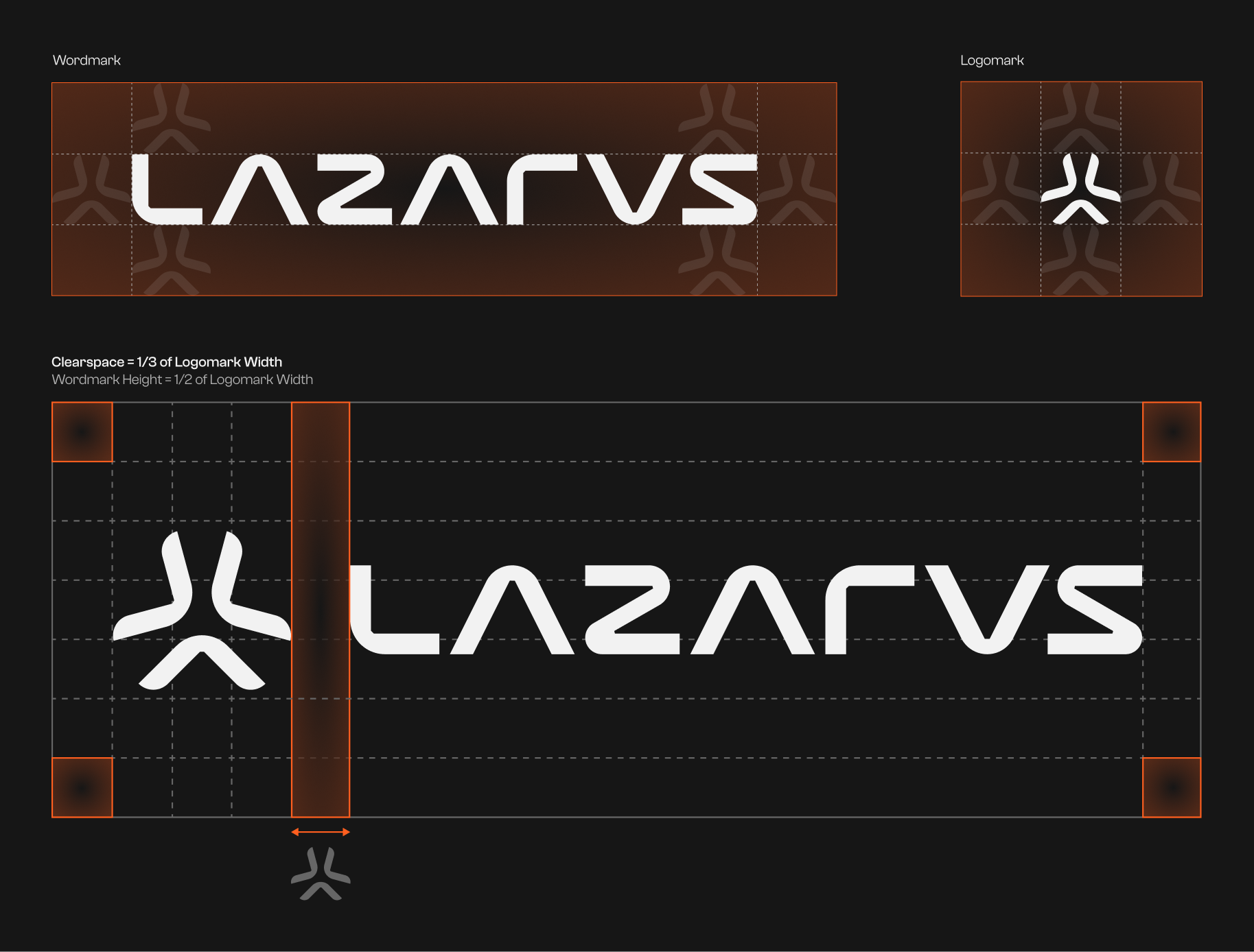
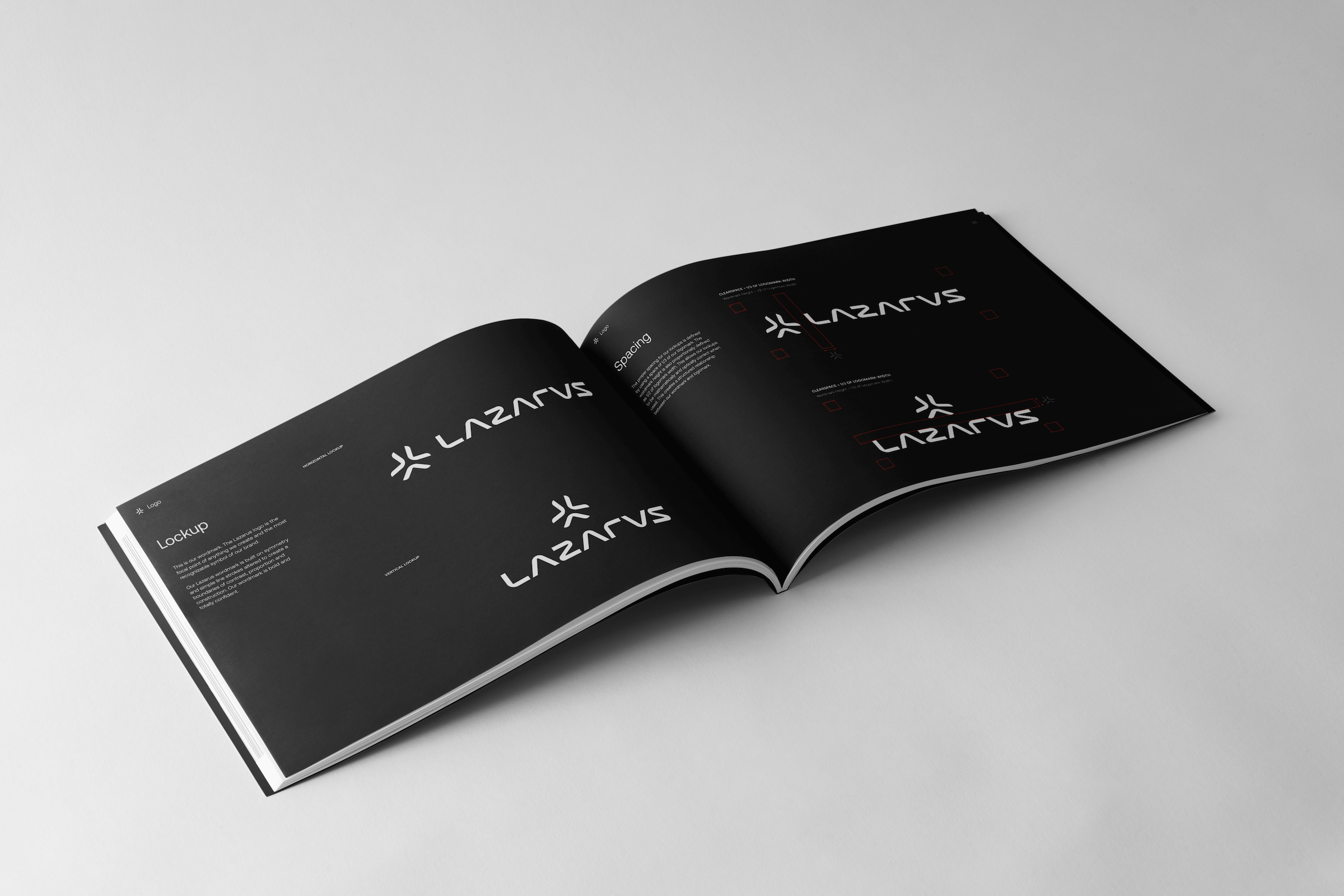
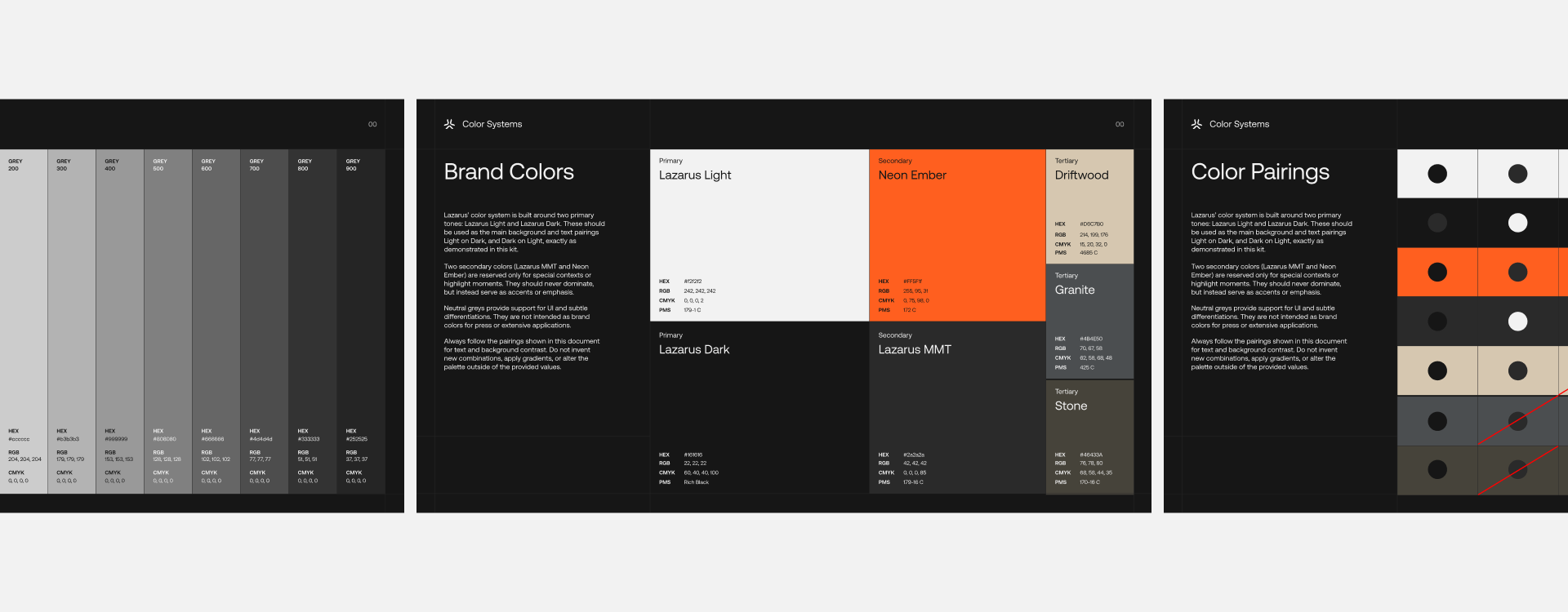
The existing color system was expanded through testing accessible color pairings, contrast ratios, and harmonious combinations, ensuring the palette functioned both aesthetically and practically. The logo was also refined—its spacing, proportions, and clearspace were refined to create a more balanced and resilient mark. All of these decisions were documented with precise guidelines designed for use by both designers and non-designers.
These standards were then applied across a range of projects: white papers, social content, event backdrops, and a universal deck system used company-wide. Each execution served as a demonstration of a unified brand language. One that was built on clarity, consistency, and a respect for form.
Typographic explorations included adjustments to kerning, tracking, line-height, and scale, resulting in a rhythm that could remain stable across all applications. Paragraph rags, alignment conventions, and heading structures were formalized to create predictable, repeatable patterns that reinforced the integrity of the brand.
The existing color system was expanded through testing accessible color pairings, contrast ratios, and harmonious combinations, ensuring the palette functioned both aesthetically and practically. The logo was also refined—its spacing, proportions, and clearspace were refined to create a more balanced and resilient mark. All of these decisions were documented with precise guidelines designed for use by both designers and non-designers.
These standards were then applied across a range of projects: white papers, social content, event backdrops, and a universal deck system used company-wide. Each execution served as a demonstration of a unified brand language. One that was built on clarity, consistency, and a respect for form.

Visual Thinking
Lazarus lacked a unified, scalable visual identity that could support the company’s growth and long‑term success.
Over several months of research and development, the brand strategy and visual identity were created and gradually rolled out to align along the entire brand narrative. The resulting brand guidelines defined clear rules for logos, typography, color, imagery, and iconography.
This enabled internal teams to unify all collateral and gave external agencies a consistent framework for how Lazarus should be positioned, expressed, and expanded.
Sales & Marketing
Lazarus lacked a unified, scalable visual identity that could support the company’s growth and long‑term success.
Over several months of research and development, the brand strategy and visual identity were created and gradually rolled out to align along the entire brand narrative. The resulting brand guidelines defined clear rules for logos, typography, color, imagery, and iconography.
This enabled internal teams to unify all collateral and gave external agencies a consistent framework for how Lazarus should be positioned, expressed, and expanded.
Over several months of research and development, the brand strategy and visual identity were created and gradually rolled out to align along the entire brand narrative. The resulting brand guidelines defined clear rules for logos, typography, color, imagery, and iconography.
This enabled internal teams to unify all collateral and gave external agencies a consistent framework for how Lazarus should be positioned, expressed, and expanded.
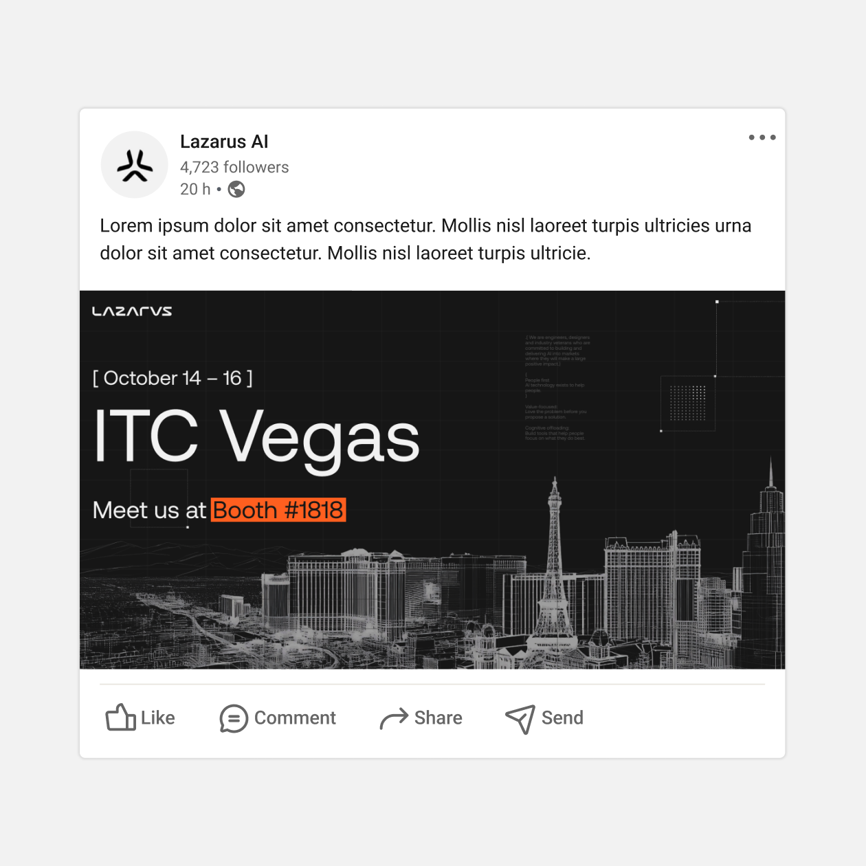
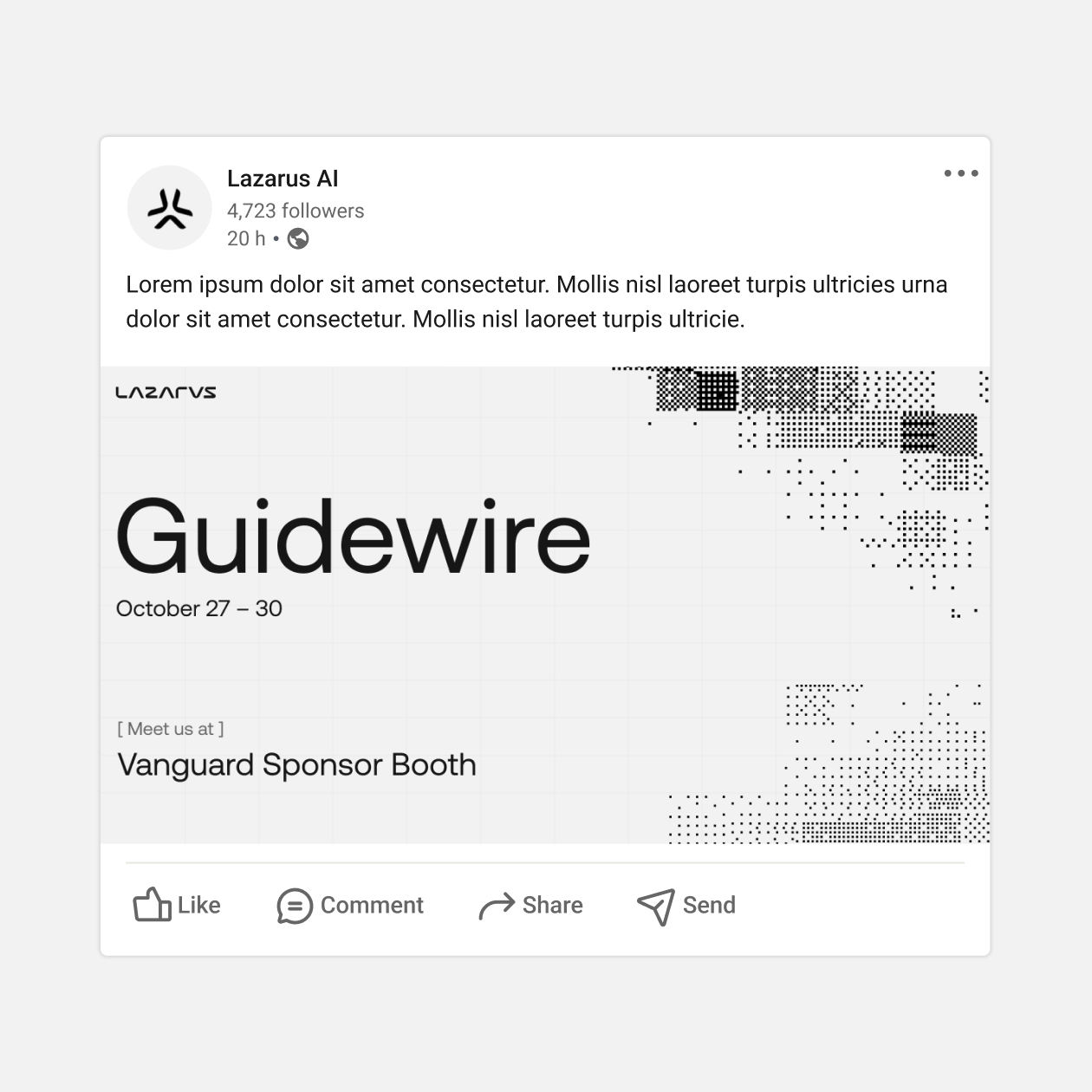
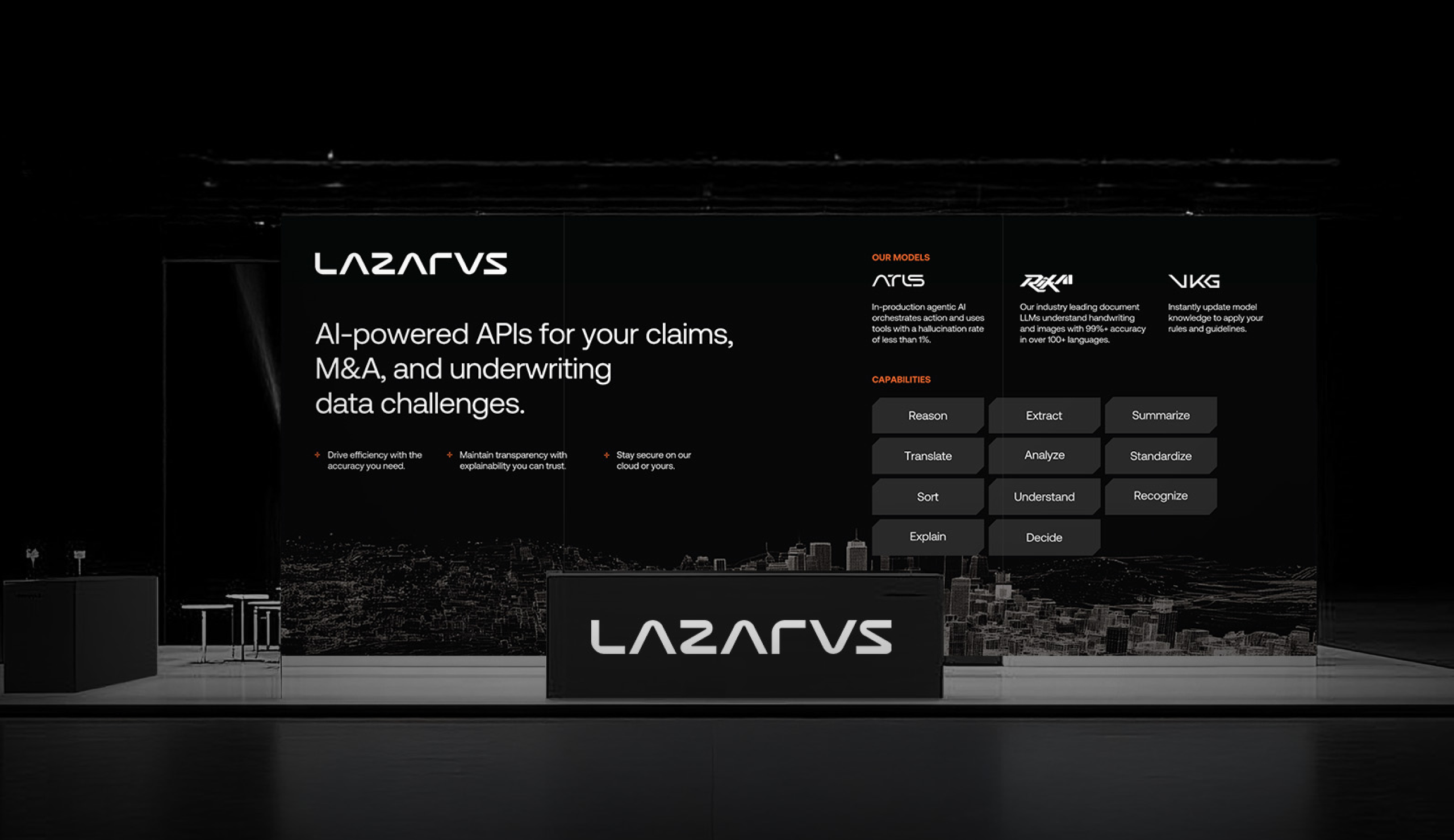
Event Experiences
Since each event and trade show offered a unique experience, every activation required a tailored strategy based on the event type, the audience attending, and which parts of the company should be highlighted.
For this event, a backdrop and booth experience was created showcasing the different AI models Lazarus offers and their respective capabilities. Serving as the main visual anchor, the panel captured the most attention and helped sales teams quickly frame their conversations by referencing specific sections of the banners to illustrate how each model works in practice.
For this event, a backdrop and booth experience was created showcasing the different AI models Lazarus offers and their respective capabilities. Serving as the main visual anchor, the panel captured the most attention and helped sales teams quickly frame their conversations by referencing specific sections of the banners to illustrate how each model works in practice.
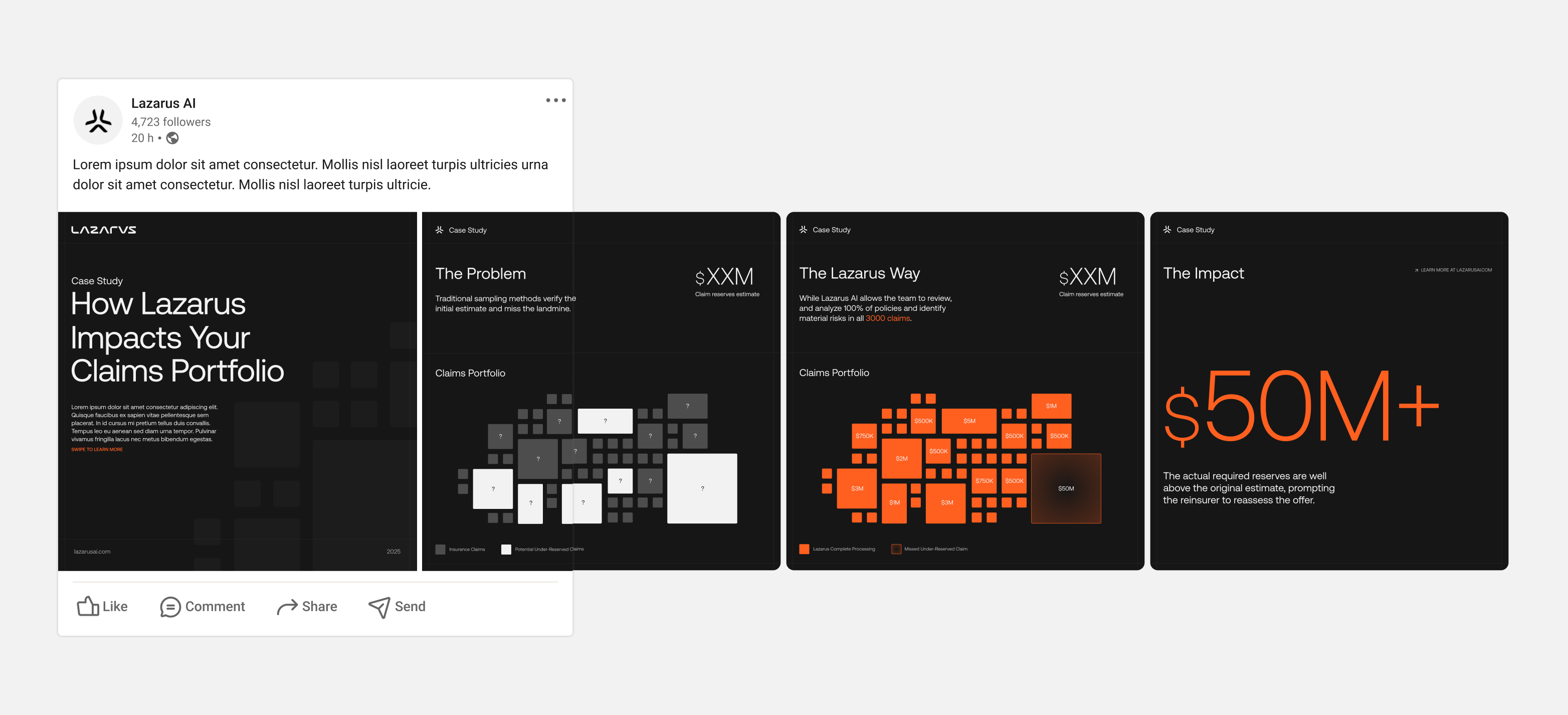
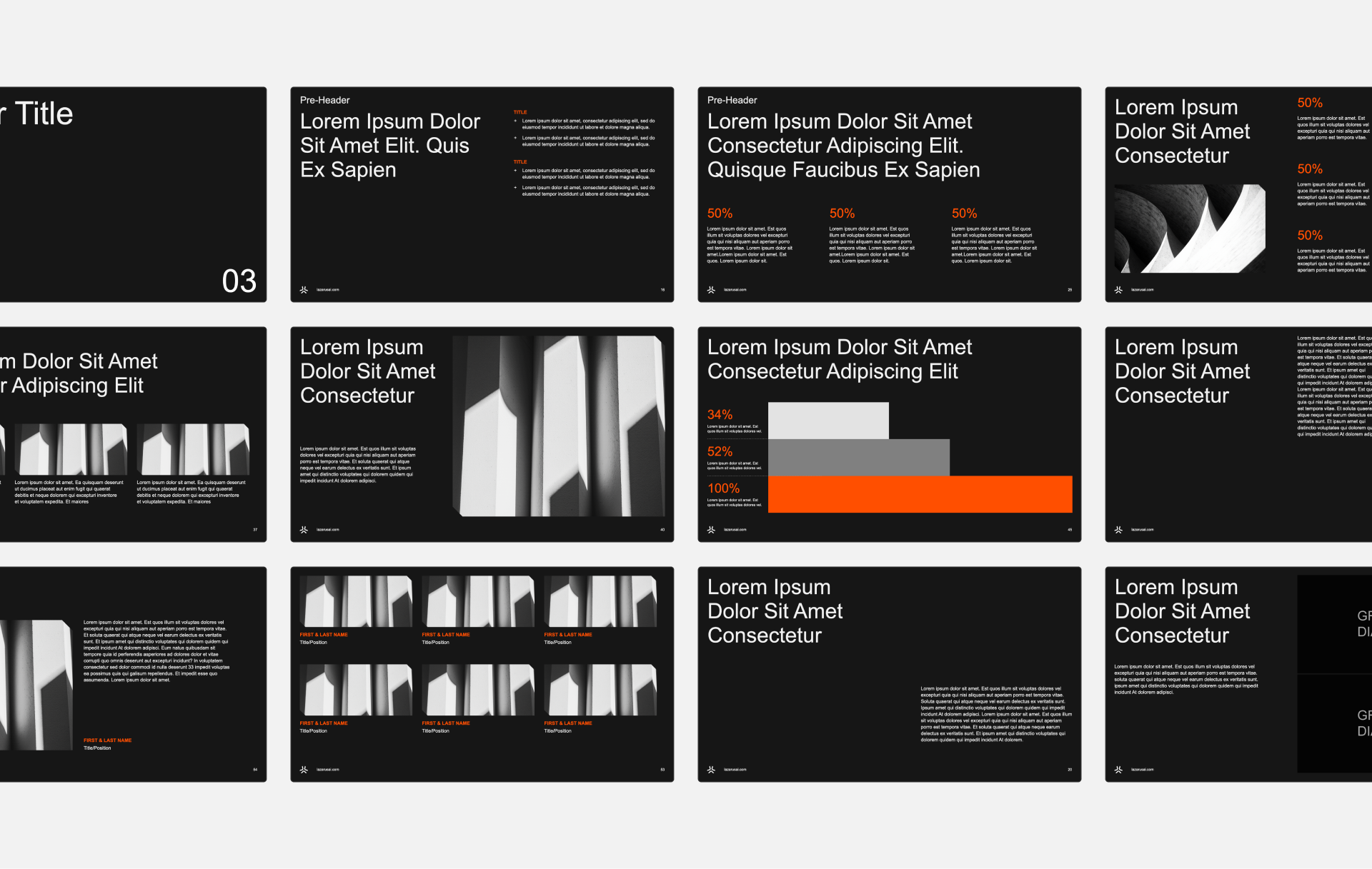
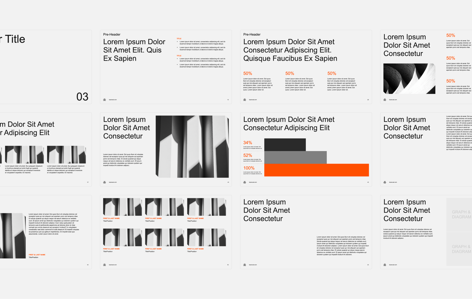
Sales Decks
Sales decks are the anchor for many B2B companies, and Lazarus was no exception.
With sales, leadership, and marketing teams requiring numerous decks for various presentations and calls, a unified template system and theme was created across PowerPoint, Keynote, and Google Slides.
The templates enabled teams to quickly build branded decks that adhered to brand guidelines, reducing the inconsistencies that often arise when non-designers create presentations. Team members could easily add images, work with pre-aligned typography, and use established layouts without modification.
In addition, interactive presentation decks were developed for recurring use in new client calls, product demos, and partnership discussions. These decks once again, delivered a clear visual narrative that transformed complex ideas into easily understood experiences.
See More Work
FullTilt Labs
An emerging cannabis cultivation brand across the state of NJ.
Lunchbox
Providing top tech solutions for industry leading food brands.
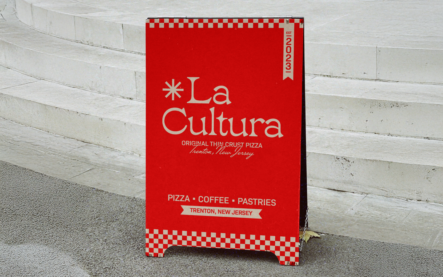
La Cultura
The original thin crust pizza, inspired by Trenton, made with love.